Sermon Series Branding
Art Direction, Branding
Project Notes:
During my time with the Communications Team of The Chapel, we branded each sermon series with a visual identity. We would take cues from the Senior Pastors and conceptualize several of the initial ideas. As lead designer for a given series, I developed these ideas into the final brand, collaborating with others to create a seamless look across print, web, and video elements.
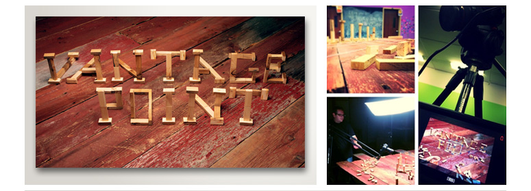
Vantage Point
Vantage Point was a series based on the story of The Prodigal Son looking from three distinct points of view: the younger brother, the elder brother, and the Father. The main theme being that it depends on how you look at something to get the full meaning. I created this look with wood blocks, however, you can only read the title if you are looking from the correct angle i.e. vantage point. Check out the video for a modern day interpretation of the parable or scroll to 1:35 to see the final look for the branding reveal itself.
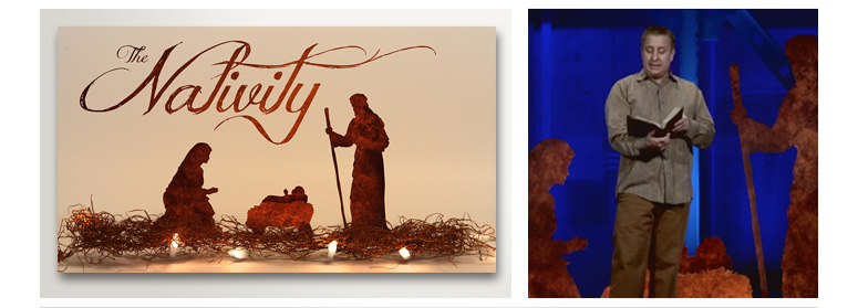
The Nativity
The Nativity was a series leading up to the Christmas holiday. The teaching pastor wanted life sized nativity characters with him on stage to reference. To create a cohesive look and experience we had life size cutouts made for the stage, medium sized cutouts made for a manger scene set-up in the lobbies, and I made a small version for our bumper. I developed and shot the video as well. It’s my hands setting up the scene.